

Written by students who passed Immediately available after payment Read online or as PDF Wrong document? Swap it for free 4.6 TrustPilot
logo-home
Exam (elaborations)

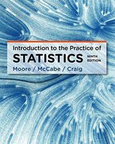
TEST BANK FOR Introduction to the Practice of Statistics 9TH Edition By David S. Moore, George P. McCabe, Bruce Craig

Rating
-
Sold
4
Pages
419
Grade
A+
Uploaded on
16-11-2021
Written in
2021/2022

Exam (elaborations) TEST BANK FOR Introduction to the Practice of Statistics 9TH Edition By David S. Moore, George P. McCabe, Bruce Craig Chapter 1 Solutions 1.1. Most students will prefer to work in seconds, to avoid having to work with decimals or fractions. 1.2. Who? The individuals in the data set are students in a statistics class. What? There are eight variables: ID (a label, with no units); Exam1, Exam2, Homework, Final, and Project (in units in “points,” scaled from 0 to 100); TotalPoints (in points, computed from the other scores, on a scale of 0 to 900); and Grade (A, B, C, D, and E). Why? The primary purpose of the data is to assign grades to the students in this class, and (presumably) the variables are appropriate for this purpose. (The data might also be useful for other purposes.) 1.3. Exam1 = 79, Exam2 = 88, Final = 88. 1.4. For this student, TotalPoints = 2 · 86+2 · 82+3 · 77+2 · 90+80 = 827, so the grade is B. 1.5. The cases are apartments. There are five variables: rent (quantitative), cable (categorical), pets (categorical), bedrooms (quantitative), distance to campus (quantitative). 1.6. (a) To find injuries per worker, divide the rates in Example 1.6 by 100,000 (or, redo the computations without multiplying by 100,000). For wage and salary workers, there are 0. fatal injuries per worker. For self-employed workers, there are 0. fatal injuries per worker. (b) These rates are 1/10 the size of those in Example 1.6, or 10,000 times larger than those in part (a): 0.34 fatal injuries per 10,000 wage/salary workers, and 0.99 fatal injuries per 10,000 self-employed workers. (c) The rates in Example 1.6 would probably be more easily understood by most people, because numbers like 3.4 and 9.9 feel more “familiar.” (It might be even better to give rates per million worker: 34 and 99.) 1.7. Shown are two possible stemplots; the first uses split stems (described on page 11 of the text). The scores are slightly left-skewed; most range from 70 to the low 90s. 5 58 6 0 6 58 7 0023 7 5558 8 00003 8 5557 9 9 8 5 58 6 058 7 8 9 1.8. Preferences will vary. However, the stemplot in Figure 1.8 shows a bit more detail, which is useful for comparing the two distributions. 1.9. (a) The stemplot of the altered data is shown on the right. (b) Blank stems should always be retained (except at the beginning or end of the stemplot), because the gap in the distribution is an important piece of information about the data. 1 6 22 5568 3 34 3 55678 4 4 8 5 1 53 54 Chapter 1 Looking at Data—Distributions 1.10. Student preferences will vary. The stemplot has the advantage of showing each individual score. Note that this histogram has the same shape as the second histogram in Exercise 1.7. 100 0 1 2 3 4 5 6 7 8 9 Frequency First exam scores 1.11. Student preferences may vary, but the larger classes in this histogram hide a lot of detail. 0 2 4 6 8 10 12 14 16 18 Frequency First exam scores 1.12. This histogram shows more details about the distribution (perhaps more detail than is useful). Note that this histogram has the same shape as the first histogram in the solution to Exercise 1.7. 0 1 2 3 4 5 6 7 Frequency First exam scores 1.13. Using either a stemplot or histogram, we see that the distribution is left-skewed, centered near 80, and spread from 55 to 98. (Of course, a histogram would not show the exact values of the maximum and minimum.) 1.14. (a) The cases are the individual employees. (b) The first four (employee identification number, last name, first name, and middle initial) are labels. Department and education level are categorical variables; number of years with the company, salary, and age are quantitative variables. (c) Column headings in student spreadsheets will vary, as will sample cases. 1.15. A Web search for “city rankings” or “best cities” will yield lots of ideas, such as crime rates, income, cost of living, entertainment and cultural activities, taxes, climate, and school system quality. (Students should be encouraged to think carefully about how some of these might be quantitatively measured.) Solutions 55 1.16. Recall that categorical variables place individuals into groups or categories, while quantitative variables “take numerical values for which arithmetic operations. . . make sense.” Variables (a), (d), and (e)—age, amount spent on food, and height—are quantitative. The answers to the other three questions—about dancing, musical instruments, and broccoli—are categorical variables. 1.18. Student answers will vary. A Web search for “college ranking methodology” gives some ideas; in recent year, U.S. News and World Report used “16 measures of academic excellence,” including academic reputation (measured by surveying college and university administrators), retention rate, graduation rate, class sizes, faculty salaries, student-faculty ratio, percentage of faculty with highest degree in their fields, quality of entering students (ACT/SAT scores, high school class rank, enrollment-to-admission ratio), financial resources, and the percentage of alumni who give to the school. 1.19. For example, blue is by far the most popular choice; 70% of respondents chose 3 of the 10 options (blue, green, and purple). blue green purple red black orange yellow brown gray white 0 5 10 15 20 25 30 35 40 Percent Favorite color 1.20. For example, opinions about least-favorite color are somewhat more varied than favorite colors. Interestingly, purple is liked and disliked by about the same fractions of people. orange brown purple yellow gray green white red black blue 0 5 10 15 20 25 30 Percent Least favorite color 1.21. (a) There were 232 total respondents. The table that follows gives the percents; for example, 10 232 .= 4.31%. (b) The bar graph is on the following page. (c) For example, 87.5% of the group were between 19 and 50. (d) The age-group classes do not have equal width: The first is 18 years wide, the second is 6 years wide, the third is 11 years wide, etc. Note: In order to produce a histogram from the given data, the bar for the first age group would have to be three times as wide as the second bar, the third bar would have to be wider than the second bar by a factor of 11/6, etc. Additionally, if we change a bar’s 56 Chapter 1 Looking at Data—Distributions width by a factor of x, we would need to change that bar’s height by a factor of 1/x. Age group (years) Percent 1 to 18 4.31% 19 to 24 41.81% 25 to 35 30.17% 36 to 50 15.52% 51 to 69 6.03% 70 and over 2.16% 1 to 18 19 to 24 25 to 35 36 to 50 51 to 69 70 and over 0 5 10 15 20 25 30 35 40 Percent Age group (years) 1.22. (a) & (b) The bar graph and pie charts are shown below. (c) A clear majority (76%) agree or strongly agree that they browse more with the iPhone than with their previous phone. (d) Student preferences will vary. Some might prefer the pie chart because it is more familiar. Strongly agree Mildly agree Mildly disagree Strongly disagree 0 10 20 30 40 50 Response percent Strongly agree Mildly agree Mildly disagree Strongly disagree 1.23. Ordering bars by decreasing height shows the models most affected by iPhone sales. However, because “other phone” and ”replaced nothing” are different than the other categories, it makes sense to place those two bars last (in any order). Motorola Razr Windows Mobile BlackBerry Palm Sidekick Symbian Other Nothing 0 5 10 15 20 25 Replacement percent Previous phone model Solutions 57 1.24. (a) The weights add to 254.2 million tons, and the percents add to 99.9. (b) & (c) The bar graph and pie chart are shown below. Yard trimmings Food scraps Plastics Metals Rubber, leather, textiles Wood Glass Other 0 5 10 15 20 25 30 Percent of total waste Source Paper, paperboard Paper Yard trimmings Food scraps Plastics Metals Wood Glass Other Rubber, leather, textile 1.25. (a) & (b) Both bar graphs are shown below. (c) The ordered bars in the graph from (b) make it easier to identify those materials that are frequently recycled and those that are not. (d) Each percent represents part of a different whole. (For example, 2.6% of food scraps are recycled; 23.7% of glass is recycled, etc.) Food scraps Glass Metals Paper Plastics Rubber Wood Trimmings Other 0 10 20 30 40 50 60 Percent recycled Material Trimmings Paper Metals Glass Rubber Wood Plastics Food scraps Other 0 10 20 30 40 50 60 Percent recycled Material 1.26. (a) The bar graph is shown on the right. (b) The graph clearly illustrates the dominance of Google; its bar dwarfs those of the other search engines. Google Yahoo MSN AOL Microsoft Live Ask Other 0 10 20 30 40 50 60 70 80 Market share (%) Search engine 58 Chapter 1 Looking at Data—Distributions 1.27. The two bar graphs are shown below. Adult Financial Health Leisure Products Scams 0 5 10 15 20 Percent of all spam Type of spam Products Financial Adult Scams Leisure Health 0 5 10 15 20 Type of spam 1.28. (a) The bar graph is below. (b) The number of Facebook users trails off rapidly after the top seven or so. (Of course, this is due in part to the variation in the populations of these countries. For example, that Norway has nearly half as many Facebook users as France is remarkable, because the 2008 populations of France and Norway were about 62.3 million and 4.8 million, respectively.) United Kingdom Canada Turkey Australia Colombia Chile France Norway Sweden Mexico Venezuela South Africa Hong Kong Egypt Denmark Spain India Germany Israel Italy 0 2 4 6 8 10 Facebook users (millions) Country 1.29. (a) Most countries had moderate (single- or double-digit) increases in Facebook usages. Chile (2197%) is an extreme outlier, as are (maybe) Venezuela (683%) and Colombia (246%). (b) In the stemplot on the right, Chile and Venezuela have been omitted, and stems are split five ways. (c) One observation is that, even without the outliers, the distribution is right-skewed. (d) The stemplot can show some of the detail of the low part of the distribution, if the outliers are omitted. 0 000 0 2333 0 4444 0 6 0 99 1 1 33 1 11222 4 Solutions 59 1.30. (a) The given percentages refer to nine distinct groups (all M.B.A. degrees, all M.Ed. degrees, and so on) rather than one single group. (b) Bar graph shown on the right. Bars are ordered by height, as suggested by the text; students may forget to do this or might arrange in the opposite order (smallest to largest). M.Ed. Ed.D. Other M.A. Other Ph.D. Other M.S. Law M.D. M.B.A. Theology 0 10 20 30 40 50 60 70 Degrees earned by women (%) Graduate degree 1.31. (a) The luxury car bar graph is below on the left; bars are in decreasing order of size (the order given in the table). (b) The intermediate car bar graph is below on the right. For this stand-alone graph, it seemed appropriate to re-order the bars by decreasing size. Students may leave the bars in the order given in the table; this (admittedly) might make comparison of the two graphs simpler. (c) The graph on the right is one possible choice for comparing the two types of cars: for each color, we have one bar for each car type. Black Silver White pearl Gray White Blue Red Yellow/gold Other 0 5 10 15 20 25 Percent Color Luxury cars Intermediate cars Black Silver White pearl Gray White Blue Red Yellow/gold Other 0 5 10 15 20 Percent of luxury cars Color Silver Other Blue Gray Black Red White White pearl Yellow/gold 0 5 10 15 20 25 Percent of intermediate cars Color 1.32. This distribution is skewed to the right, meaning that Shakespeare’s plays contain many short words (up to six letters) and fewer very long words. We would probably expect most authors to have skewed distributions, although the exact shape and spread will vary. 60 Chapter 1 Looking at Data—Distributions 1.33. Shown is the stemplot; as the text suggests, we have trimmed numbers (dropped the last digit) and split stems. 359 mg/dl appears to be an outlier. Overall, glucose levels are not under control: Only 4 of the 18 had levels in the desired range. 0 799 1 1 5577 2 0 2 57 33 5 1.34. The back-to-back stemplot on the right suggests that the individual-instruction group was more consistent (their numbers have less spread) but not more successful (only two had numbers in the desired range). Individual Class 0 799 22 1 1 5577 22222 2 0 8 2 57 33 5 1.35. The distribution is roughly symmetric, centered near 7 (or “between 6 and 7”), and spread from 2 to 13. 1.36. (a) Totals emissions would almost certainly be higher for very large countries; for example, we would expect that even with great attempts to control emissions, China (with over 1 billion people) would have higher total emissions than the smallest countries in the data set. (b) A stemplot is shown; a histogram would also be appropriate. We see a strong right skew with a peak from 0 to 0.2 metric tons per person and a smaller peak from 0.8 to 1. The three highest countries (the United States, Canada, and Australia) appear to be outliers; apart from those countries, the distribution is spread from 0 to 11 metric tons per person. 0 11 0 0 445 0 6677 0 1 001 111 67 1 9 1.37. To display the distribution, use either a stemplot or a histogram. DT scores are skewed to the right, centered near 5 or 6, spread from 0 to 18. There are no outliers. We might also note that only 11 of these 264 women (about 4%) scored 15 or higher. 0 111 0 3333 0 555 0 0 1 111 1 33333 1 1 1 8 Solutions 61 1.38. (a) The first histogram shows two modes: 5–5.2 and 5.6–5.8. (b) The second histogram has peaks in locations close to those of the first, but these peaks are much less pronounced, so they would usually be viewed as distinct modes. (c) The results will vary with the software used. 4.2 4.6 5 5.4 5.8 6.2 6.6 7 0 2 4 6 8 10 12 14 16 18 Frequency Rainwater pH 4.14 4.54 4.94 5.34 5.74 6.14 6.54 6.94 0 2 4 6 8 10 12 14 16 18 Rainwater pH 1.39. Graph (a) is studying time (Question 4); it is reasonable to expect this to be right-skewed (many students study little or not at all; a few study longer). Graph (d) is the histogram of student heights (Question 3): One would expect a fair amount of variation but no particular skewness to such a distribution. The other two graphs are (b) handedness and (c) gender—unless this was a particularly unusual class! We would expect that right-handed students should outnumber lefties substantially. (Roughly 10 to 15% of the population as a whole is left-handed.) 1.40. Sketches will vary. The distribution of coin years would be left-skewed because newer coins are more common than older coins. 1.41. (a) Not only are most responses multiples of 10; many are multiples of 30 and 60. Most people will “round” their answers when asked to give an estimate like this; in fact, the most striking answers are ones such as 115, 170, or 230. The students who claimed 360 minutes (6 hours) and 300 minutes (5 hours) may have been exaggerating. (Some students might also “consider suspicious” the student who claimed to study 0 minutes per night. As a teacher, I can easily believe that such students exist, and I suspect that some of your students might easily accept that claim as well.) (b) The stemplots suggest that women (claim to) study more than men. The approximate centers are 175 minutes for women and 120 minutes for men. Women Men 0 96 0 1 1 558 23 0 6 3 62 Chapter 1 Looking at Data—Distributions 1.42. The stemplot gives more information than a histogram (since all the original numbers can be read off the stemplot), but both give the same impression. The distribution is roughly symmetric with one value (4.88) that is somewhat low. The center of the distribution is between 5.4 and 5.5 (the median is 5.46, the mean is 5.448); if asked to give a single estimate for the “true” density of the earth, something in that range would be the best answer. 48 8 49 50 7 51 0 52 6799 53 04469 54 2467 55 03578 56 12358 57 59 58 5 1.43. (a) There are four variables: GPA, IQ, and self-concept are quantitative, while gender is categorical. (OBS is not a variable, since it is not really a “characteristic” of a student.) (b) Below. (c) The distribution is skewed to the left, with center (median) around 7.8. GPAs are spread from 0.5 to 10.8, with only 15 below 6. (d) There is more variability among the boys; in fact, there seems to be a subset of boys with GPAs from 0.5 to 4.9. Ignoring that group, the two distributions have similar shapes. 0 5 1 8 2 4 3 4689 4 0679 5 1259 6 7 99 8 9 10 01678 Female Male 0 5 1 8 2 4 4 3 689 7 4 069 952 5 1 7 789 8 8 65300 9 8 710 10 68 1.44. Stemplot at right, with split stems. The distribution is fairly symmetric—perhaps slightly left-skewed—with center around 110 (clearly above 100). IQs range from the low 70s to the high 130s, with a “gap” in the low 80s. 7 24 7 79 8 8 69 9 0133 9 6778 10 4 10 789 11 4 11 12 12 13 02 13 6 Solutions 63 1.45. Stemplot at right, with split stems. The distribution is skewed to the left, with center around 59.5. Most self-concept scores are between 35 and 73, with a few below that, and one high score of 80 (but not really high enough to be an outlier). 2 01 2 8 3 0 3 5679 4 02344 4 6799 5 4444 5 6 44444 6 77899 7 3 78 0 1.46. The time plot on the right shows that women’s times decreased quite rapidly from 1972 until the mid-1980s. Since that time, they have been fairly consistent: Almost all times since 1986 are between 141 and 147 minutes. 140 150 160 170 180 190 Winning time (minutes) Year 1.47. The total for the 24 countries was 897 days, so with Suriname, it is 897 + 694 = 1591 days, and the mean is x = 1591 25 = 63.64 days. 1.48. The mean score is x = 821 10 = 82.1. 1.49. To find the ordered list of times, start with the 24 times in Example 1.23, and add 694 to the end of the list. The ordered times (with median highlighted) are 4, 11, 14, 23, 23, 23, 23, 24, 27, 29, 31, 33, 40 , 42, 44, 44, 44, 46, 47, 60, 61, 62, 65, 77, 694 The outlier increases the median from 36.5 to 40 days, but the change is much less than the outlier’s effect on the mean. 1.50. The median of the service times is 103.5 seconds. (This is the average of the 40th and 41st numbers in the sorted list, but for a set of 80 numbers, we assume that most students will compute the median using software, which does not require that the data be sorted.) 1.51. In order, the scores are: 55, 73, 75, 80, 80 , 85 , 90, 92, 93, 98 The middle two scores are 80 and 85, so the median is M = 80 + 85 2 = 82.5. 64 Chapter 1 Looking at Data—Distributions 1.52. See the ordered list given in the previous solution. The first quartile is Q1 = 75, the median of the first five numbers: 55, 73, 75 , 80, 80. Similarly, Q3 = 92, the median of the last five numbers: 85, 90, 92 , 93, 98. 1.53. The maximum and minimum can be found by inspecting the list. The sorted list (with quartile and median locations highlighted) is 1 2 2 3 4 9 9 9 11 19 This confirms the five-number summary (1, 54.5, 103.5, 200, and 2631 seconds) given in Example 1.26. The sum of the 80 numbers is 15,726 seconds, so the mean is x = 15,726 80 = 196.575 seconds (the value 197 in the text was rounded). Note: The most tedious part of this process is sorting the numbers and adding them all up. Unless you really want to confirm that your students can sort a list of 80 numbers, consider giving the students the sorted list of times, and checking their ability to identify the locations of the quartiles. 1.54. The median and quartiles were found earlier; the minimum and maximum are easy to locate in the ordered list of scores (see the solutions to Exercises 1.51 and 1.52), so the five-number summary is Min = 55, Q1 = 75, M = 82.5, Q3 = 92, Max = 98. 1.55. Use the five-number summary from the solution to Exercise 1.54: Min = 55, Q1 = 75, M = 82.5, Q3 = 92, Max = 98 50 55 60 65 70 75 80 85 90 95 Score on first exam 1.56. The interquartile range is IQR = Q3 − Q1 = 92 − 75 = 17, so the 1.5 × IQR rule would consider as outliers scores outside the range Q1 − 25.5 = 49.5 to Q3 + 25.5 = 117.5. According to this rule, there are no outliers. 1.57. The variance can be computed from the formula s2 = 1 n − 1  (xi − x)2; for example, the first term in the sum would be (80 − 82.1)2 = 4.41. However, in practice, software or a calculator is the preferred approach; this yields s2 = 1416.9 9 = 157.43 and s = √ s2 .= 12.5472. Solutions 65 1.58. In order to have s = 0, all 5 cases must be equal; for example, 1, 1, 1, 1, 1, or 12.5, 12.5, 12.5, 12.5, 12.5. (If any two numbers are different, then xi − x would be nonzero for some i, so the sum of squared differences would be positive, so s2 0, so s 0.) 1.59. Without Suriname, the quartiles are 23 and 46.5 days; with Suriname included, they are 23 and 53.5 days. Therefore, the IQR increases from 23.5 to 30.5 days—a much less drastic change than the change in s (18.6 to 132.6 days). 1.60. Divide total score by 4: 950 4 = 237.5 points. 1.61. (a) Use a stemplot or histogram. (b) Because the distribution is skewed, the five-number summary is the best choice; in millions of dollars, it is Min Q1 M Q3 Max .5 13,416 66,667 Some students might choose the less-appropriate summary: x .= 12,144 and s .= 12,421 million dollars. (c) For example, the distribution is sharply right-skewed. (This is not surprising given that we are looking at the top 100 companies; the top fraction of most distributions will tend to be skewed to the right.) 0 444 0 88889 1 1 79 2 2 559 3 114 3 5 445 3 5 99 66 6 1.62. (a) Either a stemplot or histogram can be used to display the distribution. Two stemplots are shown on the following page: one with all points, and one with the outlier mentioned in part (b) excluded. In the table are the mean and standard deviation, as well as the five-number summary, both with and without the outlier (all values are percents). The latter is preferable because of the outlier; in particular, note the outlier’s effect on the standard deviation. (See also the solution to the next exercise.) (b) O’Doul’s is marketed as “non-alcoholic” beer. Note: In federal regulations, part of the definition of beer is that it has at least 0.5% alcohol. By that standard, O’Doul’s is a low-alcohol beverage, but it is not beer. x s Min Q1 M Q3 Max All points 4.7593 0.7523 0.4 4.30 4.7 5 6.5 No O’Doul’s 4.8106 0.5864 3.8 4.35 4.7 5 6.5 66 Chapter 1 Looking at Data—Distributions All points 0 4 0 88 4 34444 4 5 224 5 9999 6 1 6 5 Without O’Doul’s 3 88 4 4 2333 4 5 4 77777 4 9999 5 5 22 5 45 5 6666 5 6 1 6 6 5 1.63. All of these numbers are given in the table in the solution to the previous exercise. (a) x changes from 4.76% (with) to 4.81% (without); the median (4.7%) does not change. (b) s changes from 0.7523% to 0.5864%; Q1 changes from 4.3% to 4.35%, while Q3 = 5% does not change. (c) A low outlier decreases x; any kind of outlier increases s. Outliers have little or no effect on the median and quartiles. 1.64. (a) A stemplot or histogram can be used to display the distribution. Students may report either mean/standard deviation or the five-number summary (in units of calories): x s Min Q1 M Q3

Show more Read less
Institution
Course

Content preview

,Chapter 1 Solutions

1.1. Most students will prefer to work in seconds, to avoid having to work with decimals or
fractions.

1.2. Who? The individuals in the data set are students in a statistics class. What? There are
eight variables: ID (a label, with no units); Exam1, Exam2, Homework, Final, and Project
(in units in “points,” scaled from 0 to 100); TotalPoints (in points, computed from the other
scores, on a scale of 0 to 900); and Grade (A, B, C, D, and E). Why? The primary purpose
of the data is to assign grades to the students in this class, and (presumably) the variables
are appropriate for this purpose. (The data might also be useful for other purposes.)

1.3. Exam1 = 79, Exam2 = 88, Final = 88.

1.4. For this student, TotalPoints = 2 · 86 + 2 · 82 + 3 · 77 + 2 · 90 + 80 = 827, so the grade is B.

1.5. The cases are apartments. There are five variables: rent (quantitative), cable (categorical),
pets (categorical), bedrooms (quantitative), distance to campus (quantitative).

1.6. (a) To find injuries per worker, divide the rates in Example 1.6 by 100,000 (or, redo the
computations without multiplying by 100,000). For wage and salary workers, there are
0.000034 fatal injuries per worker. For self-employed workers, there are 0.000099 fatal
injuries per worker. (b) These rates are 1/10 the size of those in Example 1.6, or 10,000
times larger than those in part (a): 0.34 fatal injuries per 10,000 wage/salary workers, and
0.99 fatal injuries per 10,000 self-employed workers. (c) The rates in Example 1.6 would
probably be more easily understood by most people, because numbers like 3.4 and 9.9 feel
more “familiar.” (It might be even better to give rates per million worker: 34 and 99.)

1.7. Shown are two possible stemplots; the first uses split 5 58 5 58
stems (described on page 11 of the text). The scores are 6 0 6 058
6 58 7 00235558
slightly left-skewed; most range from 70 to the low 90s. 7 0023 8 000035557
7 5558 9 00022338
8 00003
8 5557
9 0002233
9 8

1.8. Preferences will vary. However, the stemplot in Figure 1.8 shows a bit more detail, which
is useful for comparing the two distributions.

1.9. (a) The stemplot of the altered data is shown on the right. (b) Blank stems 1 6
should always be retained (except at the beginning or end of the stemplot), 2
2 5568
because the gap in the distribution is an important piece of information about 3 34
the data. 3 55678
4 012233
4 8
5 1


53

,54 Chapter 1 Looking at Data—Distributions


1.10. Student preferences will vary. The stemplot 9
has the advantage of showing each individual 8
score. Note that this histogram has the same 7


Frequency
shape as the second histogram in Exercise 1.7. 6
5
4
3
2
1
0
50 60 70 80 90 100
First exam scores

1.11. Student preferences may vary, but the 18
larger classes in this histogram hide a lot of 16
detail. 14


Frequency
12
10
8
6
4
2
0
40 60 80 100
First exam scores

1.12. This histogram shows more details about 7
the distribution (perhaps more detail than 6
is useful). Note that this histogram has the
5
Frequency


same shape as the first histogram in the solu-
4
tion to Exercise 1.7.
3
2
1
0
55 60 65 70 75 80 85 90 95 100
First exam scores

1.13. Using either a stemplot or histogram, we see that the distribution is left-skewed, centered
near 80, and spread from 55 to 98. (Of course, a histogram would not show the exact values
of the maximum and minimum.)

1.14. (a) The cases are the individual employees. (b) The first four (employee identification
number, last name, first name, and middle initial) are labels. Department and education level
are categorical variables; number of years with the company, salary, and age are quantitative
variables. (c) Column headings in student spreadsheets will vary, as will sample cases.

1.15. A Web search for “city rankings” or “best cities” will yield lots of ideas, such as crime
rates, income, cost of living, entertainment and cultural activities, taxes, climate, and school
system quality. (Students should be encouraged to think carefully about how some of these
might be quantitatively measured.)

, Solutions 55


1.16. Recall that categorical variables place individuals into groups or categories, while
quantitative variables “take numerical values for which arithmetic operations. . . make sense.”
Variables (a), (d), and (e)—age, amount spent on food, and height—are quantitative. The
answers to the other three questions—about dancing, musical instruments, and broccoli—are
categorical variables.

1.18. Student answers will vary. A Web search for “college ranking methodology” gives
some ideas; in recent year, U.S. News and World Report used “16 measures of academic
excellence,” including academic reputation (measured by surveying college and university
administrators), retention rate, graduation rate, class sizes, faculty salaries, student-faculty
ratio, percentage of faculty with highest degree in their fields, quality of entering students
(ACT/SAT scores, high school class rank, enrollment-to-admission ratio), financial resources,
and the percentage of alumni who give to the school.

1.19. For example, blue is by far the most popu- 40
lar choice; 70% of respondents chose 3 of the 35
10 options (blue, green, and purple). 30


Percent
25
20
15
10
5
0


orange
blue
green


red
purple


yellow


gray
black


white
brown
Favorite color

1.20. For example, opinions about least-favorite 30
color are somewhat more varied than favorite
25
colors. Interestingly, purple is liked and dis-
liked by about the same fractions of people. 20
Percent


15
10
5
0
orange


blue
green


red
purple
yellow
gray


white


black
brown


Least favorite color

1.21. (a) There were 232 total respondents. The table that follows gives the percents; for
10 .
example, = 4.31%. (b) The bar graph is on the following page. (c) For example, 87.5%
232
of the group were between 19 and 50. (d) The age-group classes do not have equal width:
The first is 18 years wide, the second is 6 years wide, the third is 11 years wide, etc.
Note: In order to produce a histogram from the given data, the bar for the first age
group would have to be three times as wide as the second bar, the third bar would have to
be wider than the second bar by a factor of 11/6, etc. Additionally, if we change a bar’s
Connected book

Written for

Institution
Course

Document information

Uploaded on
November 16, 2021
Number of pages
419
Written in
2021/2022
Type
Exam (elaborations)
Contains
Questions & answers

Subjects

$14.49
Get access to the full document:

Wrong document? Swap it for free Within 14 days of purchase and before downloading, you can choose a different document. You can simply spend the amount again.
Written by students who passed
Immediately available after payment
Read online or as PDF

Get to know the seller

Seller avatar
Reputation scores are based on the amount of documents a seller has sold for a fee and the reviews they have received for those documents. There are three levels: Bronze, Silver and Gold. The better the reputation, the more your can rely on the quality of the sellers work.
Expert001 Chamberlain School Of Nursing
Follow You need to be logged in order to follow users or courses
Sold
819
Member since
4 year
Number of followers
566
Documents
1174
Last sold
1 month ago
Expert001

High quality, well written Test Banks, Guides, Solution Manuals and Exams to enhance your learning potential and take your grades to new heights. Kindly leave a review and suggestions. We do take pride in our high-quality services and we are always ready to support all clients.

4.1

162 reviews

5
105
4
18
3
14
2
8
1
17

Why students choose Stuvia

Created by fellow students, verified by reviews

Quality you can trust: written by students who passed their tests and reviewed by others who've used these notes.

Didn't get what you expected? Choose another document

No worries! You can instantly pick a different document that better fits what you're looking for.

Pay as you like, start learning right away

No subscription, no commitments. Pay the way you're used to via credit card and download your PDF document instantly.

Student with book image

“Bought, downloaded, and aced it. It really can be that simple.”

Alisha Student

Working on your references?

Create accurate citations in APA, MLA and Harvard with our free citation generator.

Working on your references?

Frequently asked questions

